What great classrooms have in common
By Catalogs Editorial Staff

Teachers know what great classrooms have in common because it starts with them
Every wise teacher knows classroom ambiance has a huge bearing and tremendous influence on how children learn. What great classrooms have in common is a teacher who puts a lot of thought and effort into establishing a space that adapts to the various needs of the students, who do not necessarily learn the same way.
The one-size-fits-all classroom is a thing of the past. Remember when desks were rigidly lined up in a straight row, facing the teacher’s intimidating desk and the black board?
Contemporary teachers realize not every child fairs well in an inflexible, drab environment. When a room is learning-friendly, it makes kids (and the teacher) want to be there. Achieve this through use of color and proper positioning of student desks, chairs, pictures, displays and other learning tools.
Some children have learning differences or disabilities. The teacher who recognizes this and makes the necessary changes to accommodate these various needs sees more success in her students than the teacher who ignores the differences.
Lighting
Small changes can result in monumental differences. What kind of lighting is in the room? Some teachers install floor- or table lights, avoiding fluorescent over-head lights, which many find quite offensive.
~
If a room isn’t well and properly lit this leads to a depressed atmosphere. No one is going to thrive in a space that looks and feels like a dungeon. When an area is properly lit, kids learn easier and there will be fewer headaches and incidents of eyestrain.
Color
What color is the room? If it is the dingy color of baby poop, don’t expect great things from the students. The mind is stimulated by certain colors. However, the older the child gets, the less stimulation he needs.
Green and blue are calming colors. Students are inspired when working in a green room. If the area is used for math or science instruction, consider painting the walls blue because it is the color of academics.
Yellow stimulates the body and brain, but avoid orange because it can disconcert.
If the space is used for active pursuits, the colors rose and light pink are good because they’re soothing. Almond or pale yellow is ideal for a busy school hallway.
Desks and Chairs
Consider the desks and chairs. Are they comfortable? Are they arranged in an optimal way? If a student isn’t comfortable it is hard for him to concentrate.
Can the students see the blackboard from their individual vantage point?
Are the desks accommodating or are they too small, too big or too high? The teacher may need to figure out some creative solutions to these problems.
Design
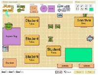
Some educators like implementing the horseshoe design in their room. The desks are situated in a C or U shape arrangement. The students can see one another and interact.
Other teachers prefer a table group, where the desks are shoved together to form a big table and the students face one another. However, the desks should be separated when tests are taken.
There needs to be sufficient space for foot traffic as well as for storage and shelves, so keep this in mind when designing the layout.
Creating a great classroom that works for everyone, or at least for the majority, may take some trial and effort. A teacher should give as much thought and consideration to arranging and decorating her classroom as she does in her own home, and perhaps even more.
If the arrangement doesn’t work, change it up. The students will enjoy the ‘newness’ of a different setting. Seeing and doing the same thing every day gets boring. They will look forward to their teacher’s burst of creativity and the changes she’s made to the space.
The classroom design has a tremendous bearing on the students and how successful their school year is
Popular Savings Offers


