Treat your coffee shop customers to vintage & retro decor. Create a beautiful retro coffee shop right away
Coffee shops are big business these days. Even in this tough economy, people are still lining up to pay $5.00 or more for a cup of joe. So it’s only natural that restaurant owners want to get in on the trend. Ready to recreate and create your own retro coffee shop? Do it!
But with a Starbucks on almost every corner and drive-through food players like McDonald’s getting into the coffee drinks game, it can be hard to find a way into what seems like a saturated market.
Think outside the pot
The key to making your coffee shop work isn’t in what you’re pouring into the cup (although offering an exceptional brew is always a good idea.) It’s not even that oh-so-tempting case filled with cookies and pastries. The real draw is in the experience. In fact, the “experience” is the main reason people love to hang out at Starbucks.
Sure, you could copy the Starbucks style. And to be sure some shop owners have made go of it with copycat designs. But it’s tough to compete head-to-head with the real thing. Instead of duplicating, what you really need is something different to draw customers away from the familiar and into your unique coffee shop. And in today’s economic climate, a retro look might be just the ticket. Why?
Down economy equals nostalgia
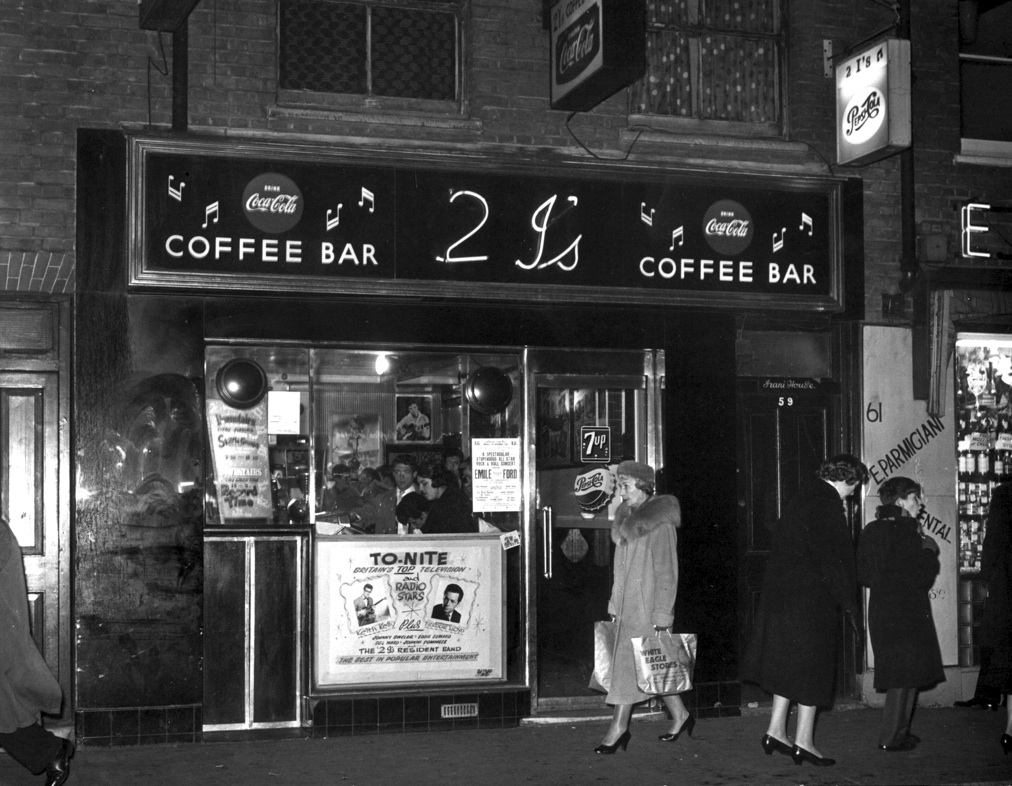
When the economy tanks, people are drawn to symbols of “the good old days.” Even younger customers who never experienced life before the 1990s love the comfort of the old-time design. And that’s where your design comes in. By paying close attention to retro decor elements, color, and lighting, you can turn a ho-hum space into a welcoming oasis from the stresses of modern life.
Ready to get started? Here’s what you need!
Start with the color
Most classic restaurant spaces were pretty neutral when it came to color. Sure, there were some bright scarlet, blazing yellow, and way-too-bright turquoise classic coffee shops out there, but most of them lean toward subtle shades of taupe, tan, cream, and brown. Even modern versions like Starbucks still to warm neutrals with jewel-tone accents. .
Start by removing any wallpaper. You want to create a warm and welcoming blank slate for your new wall art and vintage decor. Paint stark white or overly bright walls with a coat of a warm neutral. This is not a time to try and use your favorite color, or to worry about continuity with previous choices. You’re creating a feeling. And remember, you want a welcoming, not scary!
Look up, look down

What’s overhead and under your feet is just as important as what goes on the walls, so once you have the wall color selected, pay attention to these areas, too. Popcorn ceilings and Berber carpet don’t work with the image you’re trying to create. Opt for reclaimed plank floors. And if the budget allows, a mock tin ceiling is easy to install and won’t cost a fortune.
Can’t swing either right now? Scrape off any ceiling texture (there are kits to make it a bit easier) and repaint with a soft version of your wall color. And consider subway tile for the floor. While it’s not as warm as wood, it is less expensive and very easy to maintain.
What’s on the walls?

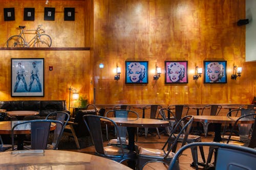
If you want to create the feel of a retro coffee shop, it’s time to dress up the walls. Vintage tin advertising signs are a great place to start. You can choose coffee-themed signs, or just choose an era and decorate with ads from that decade. Throw in some framed prints from the period, and you have a great start on your own barista-heaven.
This is time to pay attention to the details, too. Consider bringing in whimsical touches throughout the space. Vintage advertising-themed light switch covers, old-fashioned fabrics for curtains, and even classic framed mirrors in the restroom make a big difference when you’re trying to create an old-time feeling. If there’s an architectural reclamation shop near you, look for old window frames, shutters, doors, and even trim pieces that can quickly take patrons back to a simpler time.
Look at the lighting
A big part of the Starbucks atmosphere comes from the lighting. The same is true if you’re after a days-gone-by decor. Make sure the lighting is adequate for reading, but not so bright that you feel like sunglasses might be a good idea. A simple pendant light or two is good for a modern look, but floor lamps and classic table lamps are a better choice for a retro feel.
Whatever you do, skip the fluorescent lights, track lighting, and LED lights for this project. Warm lighting will make your space feel like a place where you want to relax. Harsh lighting choices, however energy efficient, are better saved for kitchens and office spaces.
Take a seat!

What’s a coffee shop without a place to sit? If you have the room to create a seating area, opt for overstuffed armchairs and love seats. For the main seating area, classic bentwood chairs around a table are a perfect choice.
If you have a coffee bar, skip the modern stools and go for simple wooden ones. Leave them natural, or paint them in a variety of colors for a splash of drama.
Just make sure the seating you select is comfortable. A great look is useless if no one wants to sit there for more than a few minutes!
Accessorize!
The last step is to select the right cups, plates, and other tabletop accessories to complete your retro coffee shop look. Again, pay attention to the period you’ve chosen, and pick dishes that match it. Not sure what to choose? Plain white restaurant supply cups, saucers, and plates work with almost any style or period, and best of all, they’re easy on the budget.
And there you go! Stock the kitchen, let people know about your new theme, and then enjoy the new flow of customers happy to step back in time for their next evening out.

