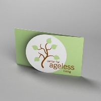
Design tips for business cards
By Catalogs Editorial Staff

Five Simple Tips for Designing Creative, Effective and Memorable Business Cards
Here is a wonderful riddle that savvy professionals can use to test their knowledge and competitive edge in the business world:
What important business tool can be key to presenting a professional image; yet only measures three and a half inches wide and two inches tall?
Need another hint?
This valuable promotional resource is paper thin and can easily fit in your wallet.
Give up?
The answer is … a business card!
The truth of the matter is, business cards are a critical marketing resource. Prepared professionals will keep business cards on hand to give out during networking events, meetings, or other social gatherings. As business cards typically contain the primary contact information for a business or individual, they are are often reproduced as camera-ready ads for newspapers, magazines or other publications.
~
The importance of business cards can not be overstated. It is wise to research design tips for business cards before creating or ordering your cards. If you are seeking ideas, inspiration, and professional perspective, here are some simple design tips for business cards that will help to ensure your cards are effective, creative and unforgettable.
Five Simple Design Tips for Business Cards:
1. Before you start designing your own business card, its helpful to do the footwork and collect samples of other business cards. Request business cards from your friends, clients and other professional contacts. Explore what you like and what you don’t like. Keep a stack of the business cards that appeal most to you. Evaluate the color, the printing quality, the paper stock, the layout and the design. What makes these particular cards original and/or professional?
2. One of the most critical design tips for business cards is legibility. Ensure that your name, job title and contact information are clearly visible and easy to read. When it comes to business cards, basic fonts are best. Some fonts are simply too difficult to read. Avoid script fonts, fonts with frilly embellishments, and faint fonts. Select dark or bold colors for your text, or, alternately, use white text on a black background. Regardless of how creative or professional a business card is, it will be useless if no one can read it.
3. In addition to legibility, including the right contact information is key. An effective business card will include a name, title, company, street address, phone and fax number, e-mail address, and website address. Other information such as a cell phone number, blog address, corporate tag line, or logo may also be worth including.
4. Printing quality is one of the biggest variables to determine whether a business card will stand out from the rest. Prior to printing business cards, consider paper stock, weight and other textures/coatings such as glossy, silk or UV coating. If you print your cards on inexpensive, flimsy paper, potential customers may dismiss your business as small or unprofessional. If you are outsourcing your printing, request paper samples from the printing company. If you plan to print business cards yourself, using a home printer, be sure to select premium grade, heavy weight, perforated stock.
5. Finally, get creative! Some of the most unique ideas for contemporary business cards include multidimensional embellishments such as embossing, raised ink, and folds. Other eye catching features include dye cutting, or cards printing in special shapes, cards printed in vertical formats as opposed to traditional horizontal layout, two sided printing, and unusual paper stock such as metallic or recycled papers.
There are many factors to consider when it comes to designing a business card. Ultimately, a well designed business card will be a conversation starter, to open the door for new opportunities.
References:
Entrepreneur.com: Creating a Great Business Card
Logo Designer Blog
Popular Savings Offers


